Window management
Over the years, Apple has added several features that could loosely be defined as "window management aids." The first, and arguably most successful, was Exposé, introduced in Panther back in 2003. Two years later, Tiger shipped with Dashboard, which provided a dedicated screen for small "widget" windows, keeping them off the main screen. In 2007, Leopard brought official support for virtual desktops to Mac OS X under the name Spaces.
Each of these features came with its own set of configurable keyboard shortcuts, hot screen corners, and (eventually) multi-touch gestures. While each was understandable and useful in isolation, it was up to each user to figure out how best to incorporate them into a workflow. In Lion, Apple has taken a stab at consolidation under the umbrella name of Mission Control. Each individual feature still exists, albeit in slightly more limited forms, but activating one thing now provides access to them all.
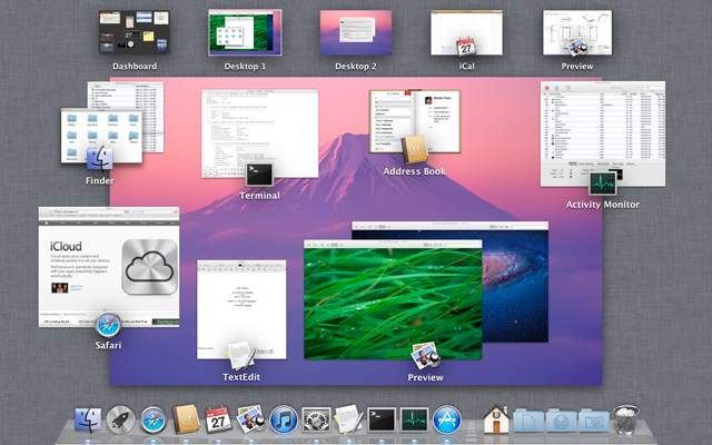
Using any one of the supported Mission Control activation methods—a keyboard shortcut, a hot screen corner, or a four-finger upwards swipe—causes the current desktop picture to recede slightly into the center of the screen, revealing behind it our old friend the linen pattern. Overlaid on this are groups of windows, badged by the icons of the applications to which they belong. Along the top of the screen sit all open Spaces. (In Lion, each full-screen window creates a new Space, so those windows appear at the top rather than grouped with the other windows from the same application.) Dashboard is also (optionally) given its own Space.

A surprising number of things can be done from this screen. As with Exposé, clicking on any window will bring it to the front. Windows can also be dragged into any of the available Spaces (excluding Dashboard and those that contain a single full-screen window). Moving the cursor (or dragging a window) to the upper-right corner of the screen causes a panel with a "+" character to appear; clicking this creates a new space. Holding down the option key makes Dashboard-style "close" widgets appear on any non-fullscreen-window Spaces (except the original Desktop Space, which can never be closed).
The biggest limitation of this new arrangement is that Spaces are now confined to a one-dimensional line of virtual desktops. Four-finger swiping between spaces feels great, but there's no wrap-around when you hit the end.
As big a step down as this is from the much more flexible grid arrangement of Spaces in earlier versions of Mac OS X, the new limitations are probably a good idea. The new behavior of full-screen windows and the surprisingly natural-feeling four-finger swipes used to switch between them and enter Mission Control means that many more Mac users will likely find themselves using these new features than ever used the combination of Exposé and Spaces in earlier versions of the OS. A simple line of spaces with no wrap-around provides a safe, understandable environment for all these new Spaces users.
For the experts, well, consolidation always has its price. In this case, as in many others, Apple has decided that the good of the many outweighs the good of the few.
Application management
For all its warts, the radical simplification of application management brought to Mac OS X by the Dock really has benefitted the platform. As I wrote in my ten year Mac OS X retrospective, "For every user who continues to be frustrated by the Dock's limitations, there are thousands of others who are buoyed in their computing efforts by its reassuring simplicity and undemanding design."
But the Dock falls short, especially for novice users, as an application launcher. Or rather, it falls short if the application to be launched isn't actually in the Dock. Most novice users I know want to have every application they are likely to use available in the Dock at all times. As these users gain experience, the Dock can become a very crowded place. But why are these increasingly Mac-savvy users stuffing their Docks to the gills rather than limiting its contents to just the applications they use most frequently?
The answer lies in how applications not in the Dock are located and launched. Choices include the Finder, Spotlight, or (I suppose) a Terminal window. Moving from an always-visible line of colorful icons that's front and center on the screen to any one of those alternatives represents a huge increase in conceptual and mechanical complexity.
If you don't understand how typing the name of an application into a search box can be so much more difficult than clicking an icon in the Dock, I suggest that you have not spent enough time with novice users. Such users often don't even know the name of the application they want—or if they do, they don't know how to spell it. That's before considering the frequent disorientation caused by the rapid-fire search results refinement animation in the Spotlight menu, or the existence of multiple files whose contents or names contain the string being searched for. And this all assumes novices know (or remember) what Spotlight is and how to activate it in the first place.
The jump in complexity from the Dock to the Finder, I think, needs less explanation. As a general rule, novice users just don't understand the file system. They don't understand the hierarchy of machines, devices, and volumes; they don't grasp the concept of the current working directory; they don't know how to identify a file or folder's position within the hierarchy. Fear of the file system practically defines novice users; it is usually the last and biggest hurdle in the journey from timid experimentation to basic technical competence.
To put it another way, your dad can't find it if it's not in the Dock. (Well, my dad can't, anyway. Sorry to all the Mac-savvy dads out there; I am one, after all.)
In Lion, Apple aims to fill that gap with an application launching interface that's meant to be as easy to use as the Dock while providing access to every application on the system. It's called Launchpad, and you'll be forgiven for thinking that it looks like yet another interface element shamelessly ported from iOS.

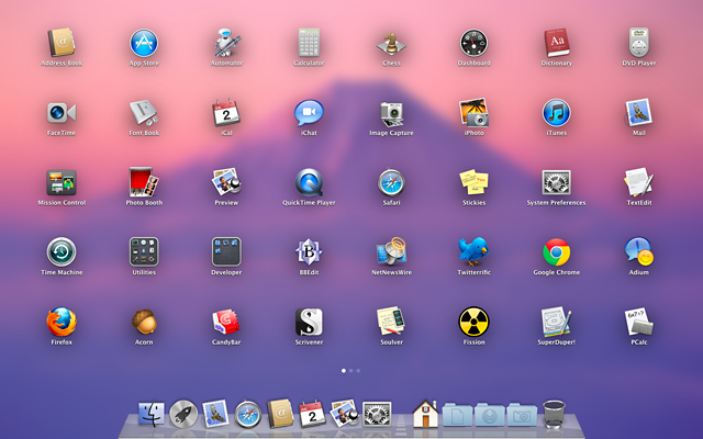
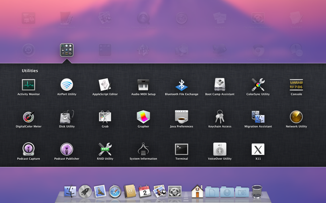
Launchpad can be activated with a Dock icon (which, importantly, is in the Lion Dock by default), a multitouch gesture (a somewhat awkward pinch with the thumb and three fingers), or by dragging the mouse cursor to a designated corner of the screen. The grid of application icons that appears doesn't just look like iOS's SpringBoard, it also behaves like it, right down to the "folders" created by dragging icons on top of each other.
Holding down the option key makes all the icons sprout close widgets as they start to wiggle. Swiping right and left on the touchpad or with a click and drag of the mouse will move from screen to screen, accompanied by a familiar iOS-like dotted page indicator.

Launchpad will find applications in the standard /Applications folder as well as ~/Applications (i.e., a folder named "Applications" in your home directory), and any subfolders within them. Applications in the ~/Downloads folder or on the desktop are not detected, which may actually be a problem for Mac users who have not yet figured out how to perform drag-and-drop application installations—yet another area where the Mac App Store will help make things simpler.

Speaking of which, when purchasing an application in the version of the Mac App Store that ships with Lion, the application icon leaps out of the Mac App Store window and lands in the next available position in the Launchpad grid, with an iOS-like progress bar overlaid on the new application's icon. If the Launchpad icon is in the Dock, it displays a similar progress bar and the icon bounces once when the download finishes.
Both serve as examples of animation that conveys useful information. "Here's where the application you just purchased has 'landed' on your Mac," the animation says. "To find it again, click the icon that just bounced in your Dock."
Given the wealth of excellent third-party application launchers available for the Mac, I'm not sure there's any reason for an expert user to use Launchpad instead of their current favorite alternative. But unlike, say, the Dock, Launchpad is easily ignored. Turn off the gesture, deactivate the hot corner, and remove the icon from the Dock and you'll never have to see it.
For everyone else, however, Launchpad will provide a huge improvement in usability. Even expert users should be excited about its arrival because it should make telephone or e-mail-based family technical support a bit easier.
reader comments
401